Temprana de Montán
Aceite de Oliva Virgen Extra
«Temprana de Montán»
2020
En el año 2010, realizamos el desarrollo de la gráfica aplicada a packaging para el Aceite Virgen Extra variedad Temprana de Montán de la Coop. Agrícola de Montán.
Diez años después, la Cooperativa, ha decidido actualizar la gráfica de todos sus envases, contando con nuestros servicios de nuevo.
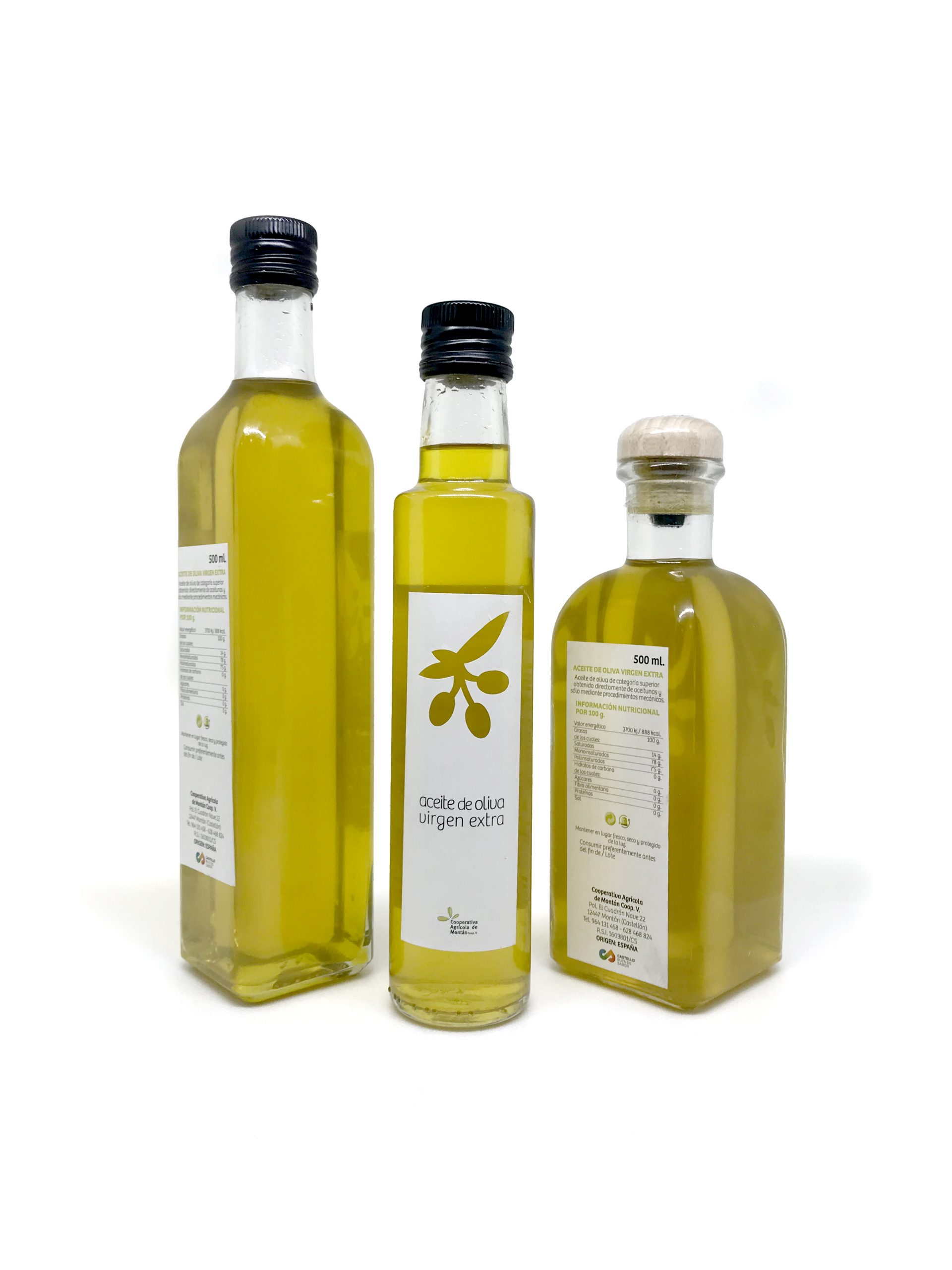
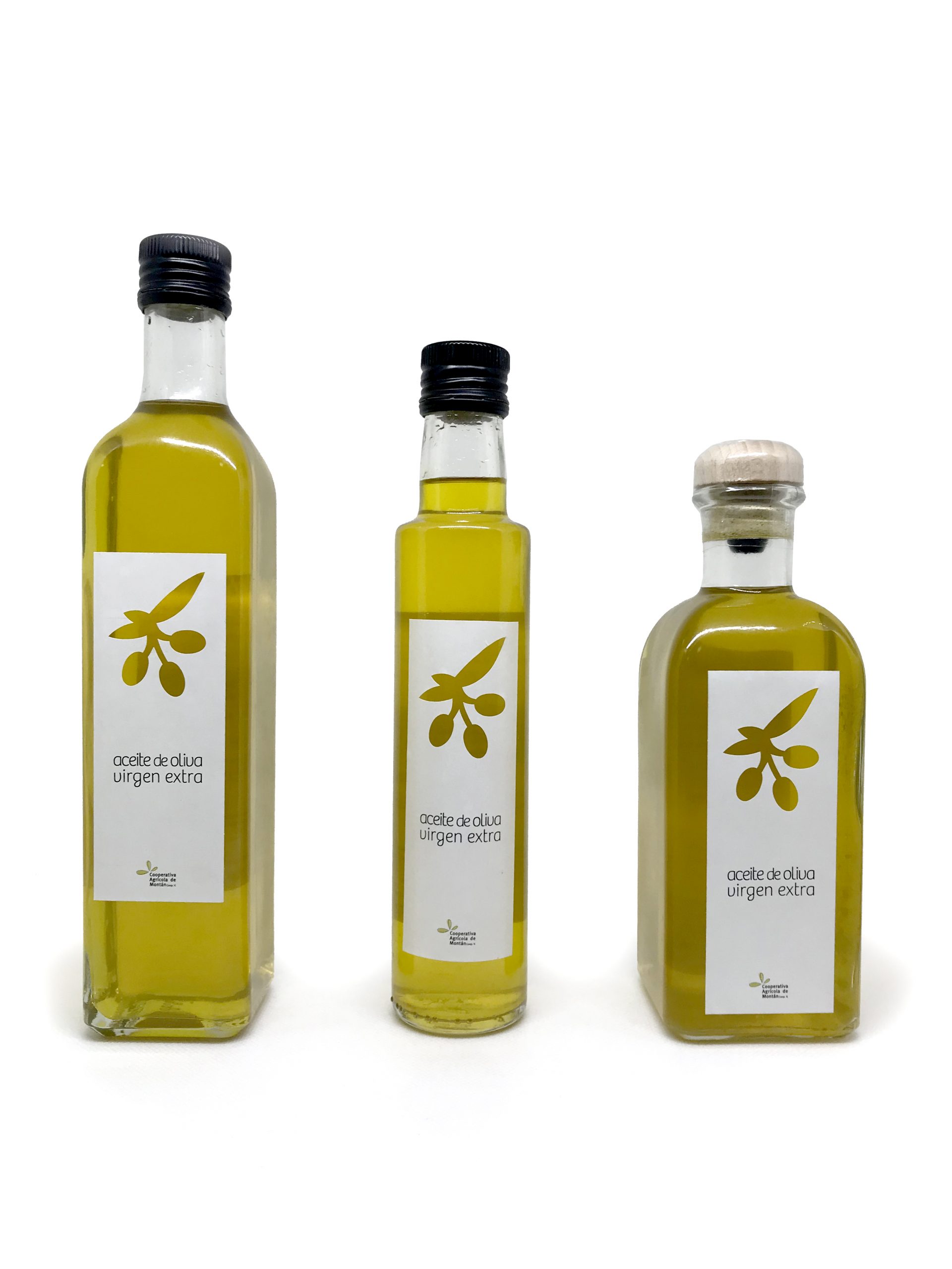
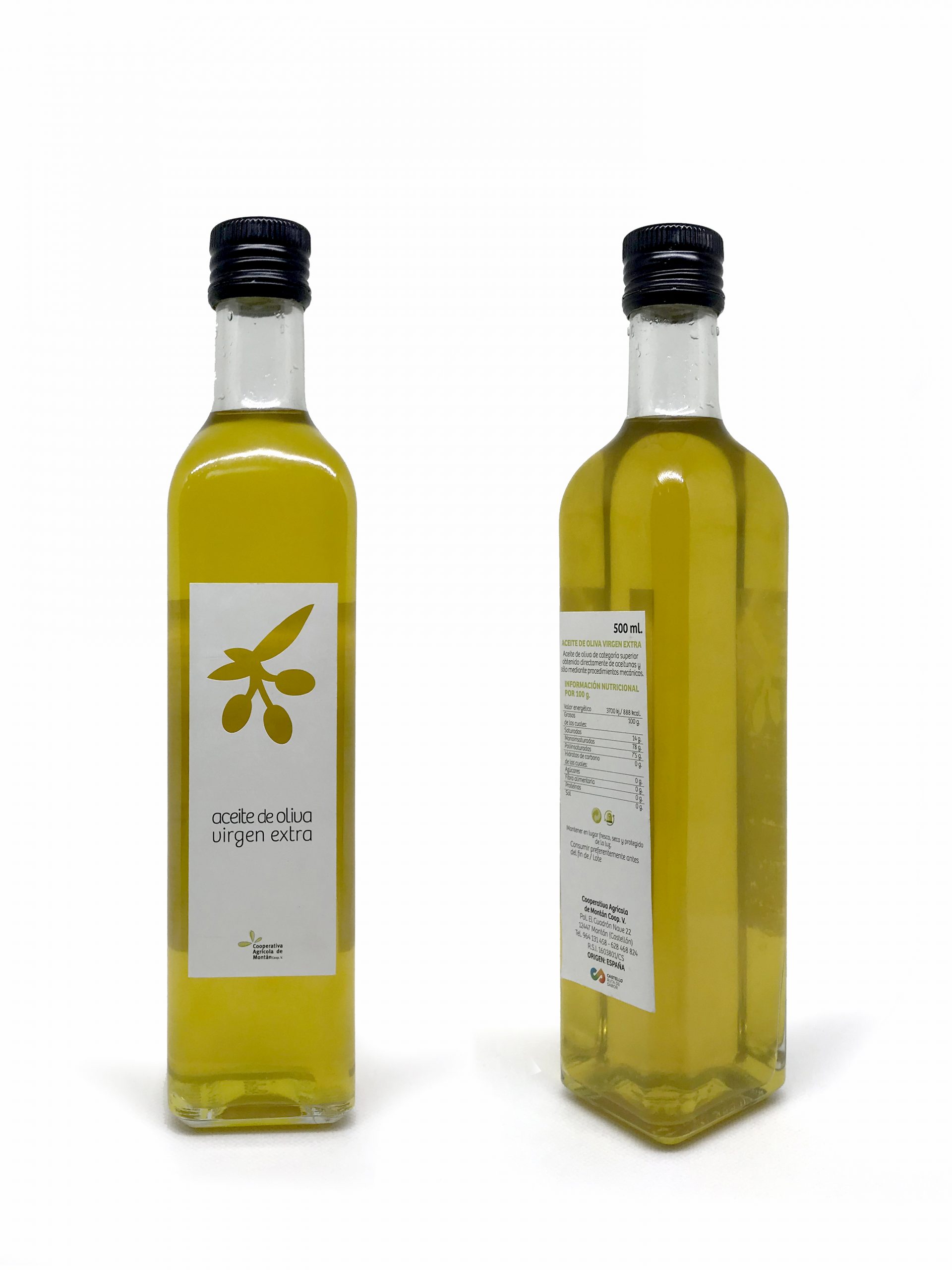
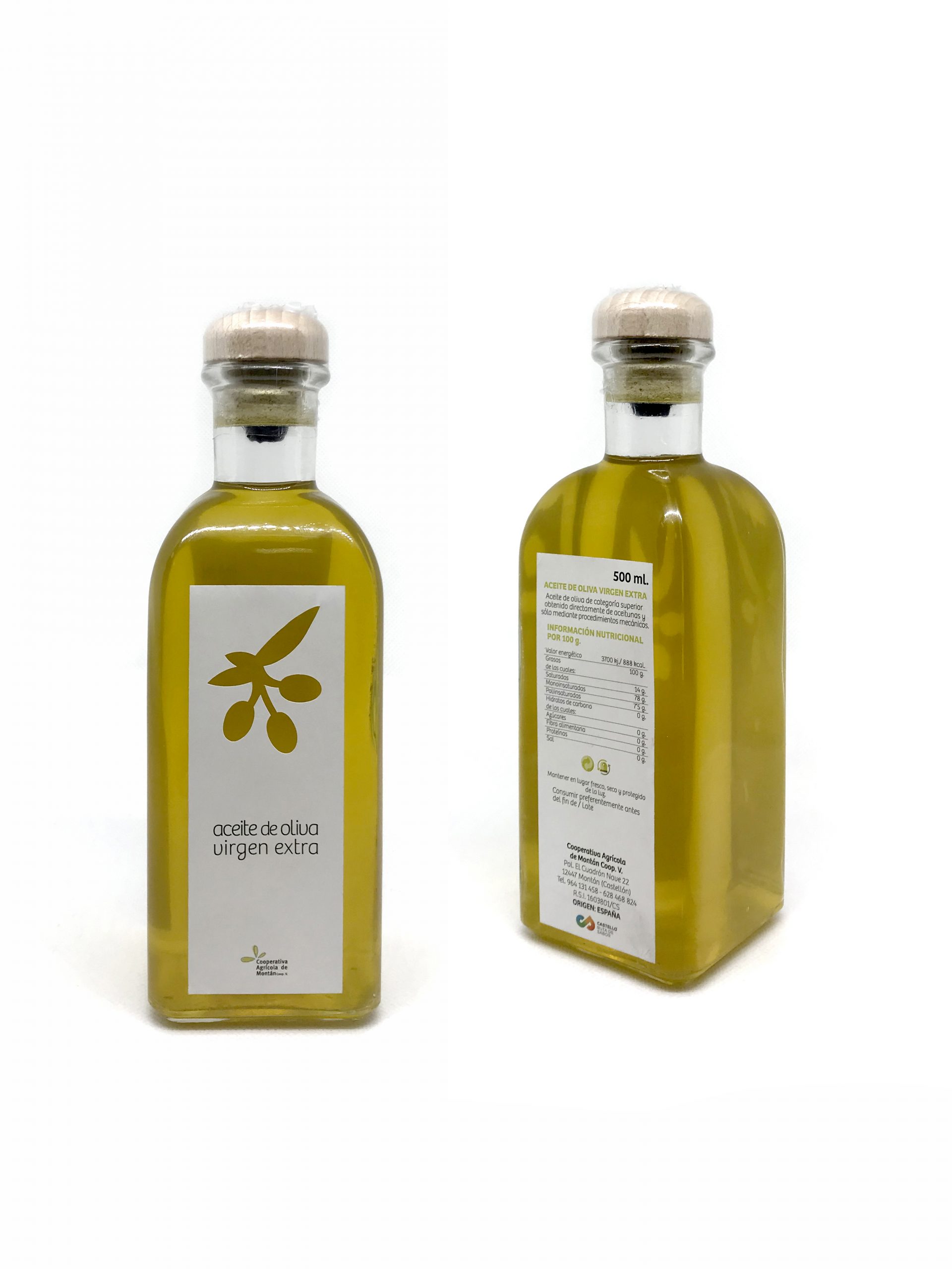
Desarrollo completo de juego de etiquetaje para las botellas; como premisa para poder realizar el diseño, fue que las mismas etiquetas nos valiesen para los 3 tipos de botella que tienen, con lo cual, lo simplificamos a 2 etiquetas, una delantera (igual para todas las botellas) y otra trasera con toda la información (que lo único que variaría serían los ml).
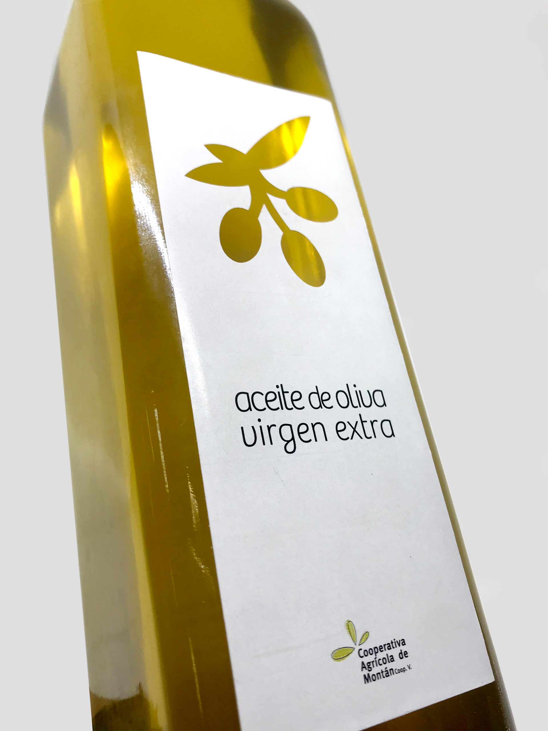
La delantera únicamente pone aceite de oliva virgen extra y el logo de la Coop. pero en su parte superior hemos incluido una rama con 3 olivas en vacio y a través de las olivas se ve el aceite. Con esto buscamos mostrar de una manera sutil el producto que vende la etiqueta a la vez que nos da un juego de luces interesante.
La tipografía en negro sobre el blanco de la etiqueta, nos equilibra con los tapones negros.
El diseño resultante nos da una botella en 3 colores, blanco con toques negros y el amarillo del aceite que es lo que realmente buscamos resaltar.
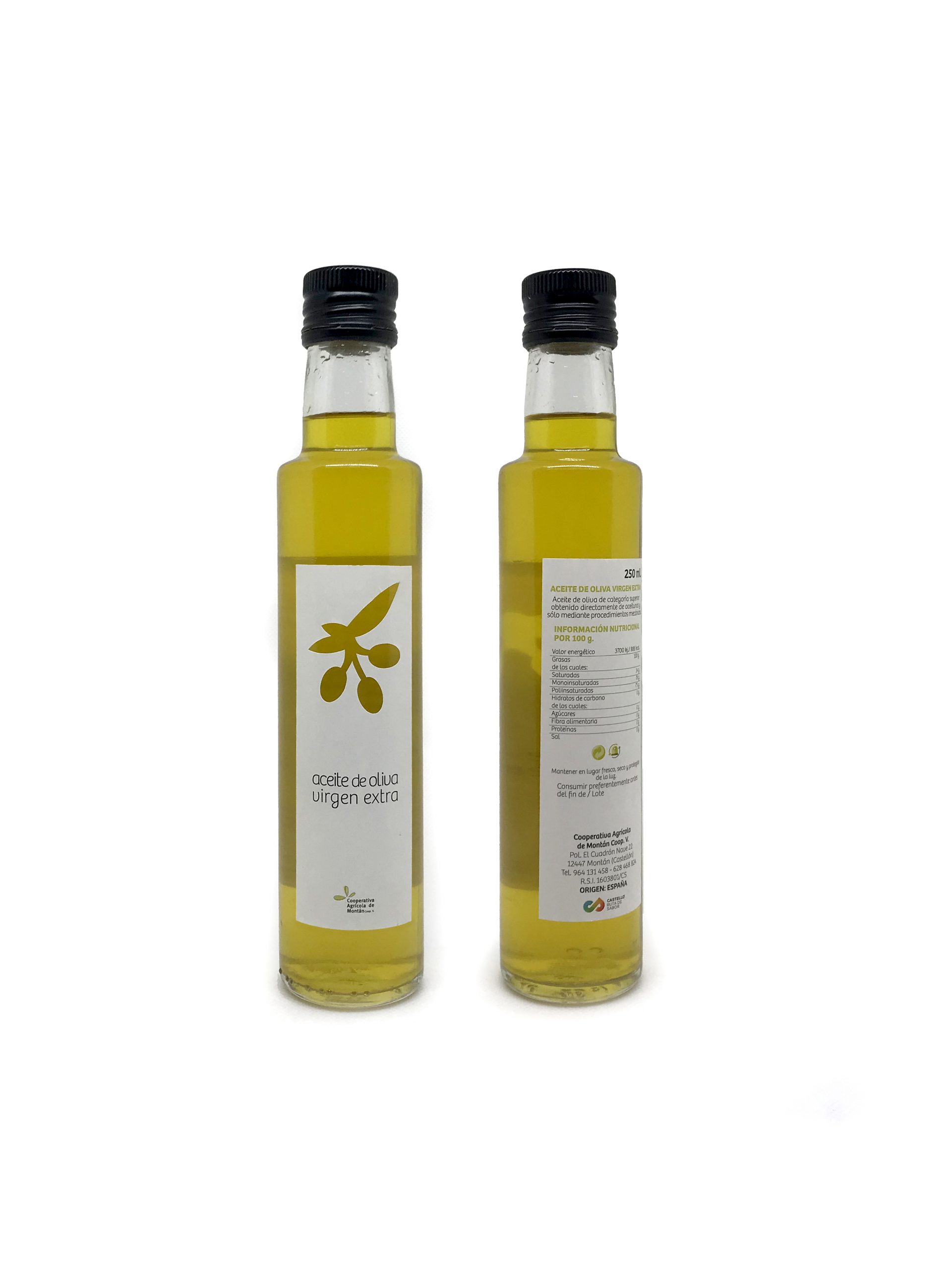
La trasera, en la parte superior derecha lleva los ML (única variante según modelo), toda la información que por ley hay que incluir, dejando un espacio para colocar la etiqueta de lote y fecha, la información de la Cooperativa y el logo de Castellón Ruta de Sabor.
—
Extra Virgin Olive Oil
«Temprana de Montán»
2020
In 2010, we developed the graphics applied to packaging for the Extra Virgin Olive Oil variety «Temprana de Montán» from Coop. Agrícola de Montán.
Ten years later, the Cooperative has decided to update the graphics of all its containers, counting on our services again.
Complete development of a labeling kit for bottles; As a premise to carry out the design, it was that the same labels were valid for the 3 types of bottle they have, with which, we simplified it to 2 labels, a front one (the same for all bottles) and a rear one with all the information. (that the only thing that would vary were the ml).
The front only puts extra virgin olive oil and the Coop. logo but in the upper part we have included a branch with 3 empty olives and the oil can be seen through the olives. With this we seek to show in a subtle way the product that the label sells while giving us an interesting play of light.
The black typography on the white of the label, balances us with the black caps.
The resulting design gives us a bottle in 3 colors, white with black touches and the yellow of the oil, which is what we really want to highlight.
The back, in the upper right part, has the ML (only variant depending on the model), all the information that by law must be included, leaving a space to place the batch and date label, the information of the Cooperative and the «Castellón Ruta de Sabor» logo.